Hey, everybody! Today, we’re working on cover art. (Poor Joy) We’re getting a little burnt out on revisions. Right now, we’re at the point where we hate EVERYTHING, so we figured we’d come to you all for opinions.
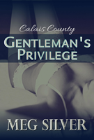
Original:
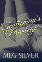
Revamp:
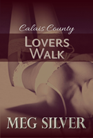
Original:
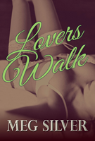
Revamp:
Fire away…
Like the new concepts? Prefer the old ones? Anything?
Discuss.
ETA: We’re going for a walk. Back in a few.
Hi Meg
I love the fourth image with Green writing – great for greenery of lovers walk – conjures up the outdoors
I like the other new image better as well – prefer the sepia type colour for tradition of Sordition
Joy totally paid you to say that. Didn’t she?
I prefer the originals because they are softer! The new ones colours are too strong and should be higher!
I like the script writing on the newer ones. But I would move the title higher on the legs so you can see the garter belt. I do like the green words they pop, but I’m not sure about them combined with the sepia, maybe black and white.
You’re over thinking it! Stick with the original. I agree with Tracey. The originals are clean crisp and bold. Don’t like the new colours or the new writing either. They just take away from it.
I like the script writing…. not so much the color combos of either one or the placement of the title. I think you might need to add the series name on there somewhere also, just for relatability. (Is that even a word? You know what I’m gettin’ at….)
I like the originals. The revamps look too… 1950s melodrama. but that’s just me.
Ok, how about the series title in the stright font, the book titles in one of the other 2 fancy fonts. I like the placement of the original and I love the green but the yellow does not pop enough for me. Also think ahead to book 3 if you are picking colors. So mix it all up or not the inside will still be HOT!
Ahem. Miss Tami might want to read Lovers Walk for SUPER SECRET REASONS
So after all that, Joy and I reached about as much consensus as you lot did; we’re sticking with the original cover for release, but might update later if we can solve some positioning problems.
(The third and final cover is the same picture but black and white for color scheme, btw. We’d post it on the CC page but I have yet to finalize the name of the final Schema)
I love that you reach out to your fans and ask our opinions! Have great time with Mr Silver!