So. After three meetings and six weeks of pondering, Book 5’s title popped into my head while I was reaching into the refrigerator for yogurt. Two phone calls later, it was finalized, and a very relieved graphic designer was able to send me more drafts.
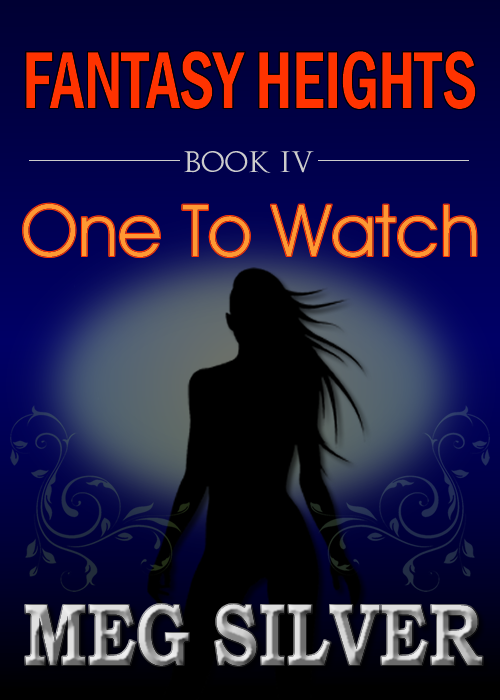
Draft 7:
 |
| draft 7 |
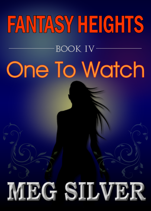
Draft 8:
 |
| draft 8 |
Draft 9:
 |
| draft 9 |
I would have been happy with any of them, but I think she sent the files in this order to torture me. I really, really liked draft 7, was a bit “meh” about draft 8, and then came draft 9 that absolutely wowed me.
Anyone have any thoughts or preferences? Do weigh in while we still have time to tweak.
And then I notice the subtitling still says Book IV.
Whoops.
i think draft 9 is the best out of the 3 posted 🙂
I really love them all but I think I like 7 the best.
Like seven best with the background colour and effect of nine. I’m not nuts about the green and blue as it is breaking too far away from the continuity of the previous covers.